Case study · Brand identity, website and motion
Little Loud, start to finish.
The brand you’re looking at right now. Every piece below is the real thing, made with the same process and handed over in the same file package a hotel gets.
The thinking
More than a pretty logo.
Lots of places start with a logo and end up with a picture rather than a brand. A few months later someone is guessing at colors for a sign or a font for a menu, and things slowly drift apart. What they needed was a system, with a little guidance written down.
So Little Loud was built the way a hotel group gets built: name first, then positioning, then the visual system, then the site, each decision made because of the one before it. The name had to work at both ends: small enough to feel personal, loud enough to promise the work gets noticed. It was checked against trademarks and domains before a single sketch.
The direction is botanical, which is a lovely and very crowded place to be. The care went into what to leave out: script, watercolor and muted sage all stayed in the sketchbook. In their place came a heavy Didone, one hot poppy, and a bloom in place of the O, so the mark and the word always travel together.
What the project covered
- Name, positioning and tagline
- Trademark and domain checks
- Logo in eight variants, outlined
- Palette with written rules
- Type system with exact settings
- The details, from cards to key cards
- A motion system
- Brand book and file package
- A website, built and launched
The mark
One mark, every ground.
A logo gets used in a hurry, on a phone, often by someone who isn’t a designer. So it has to look lovely in one color, on a dark background and at the size of a sticker.
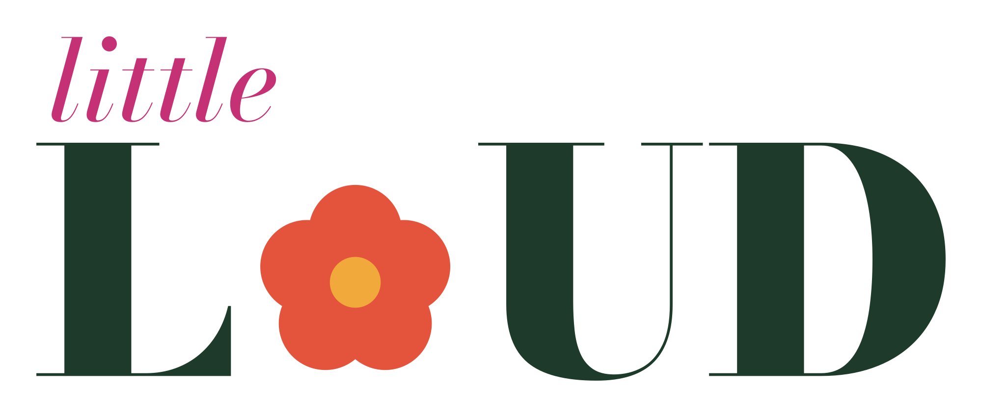 Primary
 Reversed
 The bloom
 Confetti, dark grounds only
Color
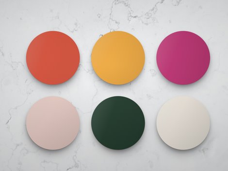
Eight colors, each with a job.
Every color comes with a little written note, because the next person to use it is often a sign maker or a new hire rather than a designer. All the numbers, in the brand book
#E4533BThe bloom’s petals and the hero color, saved for one loud moment per page and kept away from body text.
#B23A25Buttons and the brick rooms, and poppy’s stand-in wherever text has to be read.
#C43174“little” in the wordmark, labels, and the pink rooms.
#F6D8D0The soft tint behind it all. On blush, poppy and peony deepen so text stays readable.
#F2A93BThe bloom’s center, the warm rooms and the brightest accents.
#1E3A2A“LOUD” in the wordmark, every headline and paragraph, and the fine stem lines.
#FBF4EAEvery light ground, and “LOUD” when the logo is reversed.
#FFFBF5Cards and paper sitting on cream, a shade brighter so they lift off the page.
Plus one text shade: on blush and marigold, small peony type deepens to #A82A62 so it stays readable.
Type
The setting that usually gets lost.
Small roots. Big bloom.
Bodoni Moda has a hidden setting that thins its strokes as the type gets bigger. Left on automatic, it looks elegant in a specimen and then all but disappears on a printed sign or a sunlit phone. Try the switch. The brand pins it: 24 for headlines, 16 for section heads, 11 for anything smaller, and that one line is written into the brand book because it’s the easiest thing to miss.
Everything a guest actually reads: prices, hours, the small print. It’s plain on purpose. The display face brings the personality, and the text face stays out of its way, so a paragraph is never hard work.
The details
The whole system, on everything.
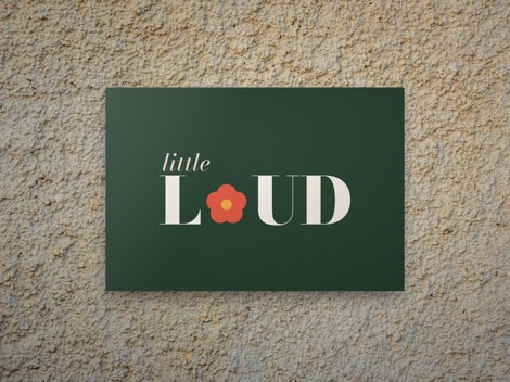
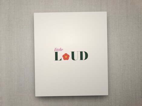
A logo is one file. A brand is what happens when the same decisions carry all the way down to a business card and a key card. Nothing below needed a new color, a new font or a new idea.
hello@littleloudmarketing.com
littleloudmarketing.com
Palm Desert, California

Motion
A brand that moves like itself.
A website, a reel and a lobby screen should all move the same way, so the brand book has a motion chapter with six rules. Hover each one. Read the motion chapter
Two eases
A soft one for things arriving, and one with a little bounce for things that pop. Nothing else.
One reveal
Lines rise into place, and the italic word lands a beat later in poppy.
It opens as a bloom
Pages, menus and rooms open through the bloom’s own shape, growing from a point like a flower unfolding.
Lines draw in
Stems and leaves draw themselves in, stem first, then leaves, then the bloom, the way a plant grows.
One petal
When something is pressed or opened, the bloom turns exactly one petal: 72 degrees.
Gentle, always
One big movement at a time, words you can read right away, and everything still lovely with motion turned off.
The handover
What a hotel actually receives.
Most owners never get to see what a branding project actually hands over, so here it all is. It arrives in a folder that’s yours to keep.
The logo, every way
Primary, reversed, one-color and the mark on its own, with text outlined so it works anywhere, no font needed.
A brand book
Which file goes where, minimum sizes, clear space, what not to do and every color in HEX, RGB and CMYK.
Type and motion
The faces, the exact settings and the motion chapter, so the next designer or video editor keeps it consistent.
The files are yours
If you ever work with someone else, they can pick it up and carry on beautifully, no permission needed.
Your turn
Want this for your hotel?
A complete brand starts at $10,000 and takes about six weeks. A website on top of it starts at $7,000. You own every file either way.
Know a hotel that would love this?